.png)
.png)
Skillora
February 2025 - April 2025

Project Brief
This project was completed as part of a graduate-level UX course focused on designing for social good, addressing real-world community challenges through thoughtful digital solutions. The goal was to simulate a professional design environment while developing core UX skills such as collaboration, prototyping, and usability testing.
Description
As part of my master’s program, I helped design a conceptual adult online learning platform centred around community-driven education and peer connection. The platform fosters meaningful engagement by encouraging learners to share resources, stay motivated through challenges and leaderboards, and connect with instructors through on-the-go learning tools like podcasts. I conducted market and secondary research to shape our feature set, mapped key touchpoints to integrate them into the user journey, and prototyped interactions for usability testing. This project showcases my ability to design inclusive, community-focused digital experiences that empower users through collective growth and real-world relevance.

Here's What I Did...
As a UX Designer and Researcher on the Skillora project, I worked collaboratively across the entire design process — from early research and ideation to prototyping, testing, and UI refinement.
Research & Discovery
-
Assisted with secondary research to better understand user needs, digital learning platforms, and market gaps
-
Helped analyze and synthesize research findings to support early feature ideation
Ideation
-
Collaborated with the team to prioritize features based on user needs and research insights
-
Participated in early brainstorming sessions that shaped the product direction
Wireframing & UX Design
-
Co-created initial wireframes alongside two other designers
-
Led UX design for the Podcast Page, ensuring structure aligned with user goals and accessibility
-
Contributed to wireframes for the Home Page and other shared components
UI Design & Prototyping
-
Designed the UI for both the Podcast and Home Pages, focusing on usability and visual cohesion
-
Contributed to building an interactive prototype for usability testing
Usability Testing
-
Served as a moderator during usability testing sessions
-
Collaboratively reviewed feedback and test results to identify UX issues and improvement areas
-
Contributed to implementing UI and UX changes based on findings
Post-Project UI Enhancements
-
After the main project wrap-up, took initiative to refine and polish key UI elements for improved consistency and clarity
01. Research & Discovery
Research
Secondary Research
To better understand how to support adult learners in online environments, we reviewed academic literature focused on engagement, motivation, and community. Our guiding question was: "How might we design a solution that helps adult learners feel engaged during their learning journey?" We found consistent evidence that social interaction and a sense of community significantly improve learner engagement. Research highlighted the emotional impact of isolation and emphasized the value of peer interaction and knowledge-sharing. One study also showed that audio-based features can strengthen instructor presence, enhancing connection in virtual spaces. These insights directly informed our design decisions, leading us to prioritize community-driven features and incorporate audio learning tools to support both peer and instructor engagement.
Online learners often begin with high motivation, but enthusiasm tends to decline mid-course, contributing to lower completion rates. Several factors including lack of structure, limited interaction, and minimal accountability all play a role. However, strategic course design can help mitigate these challenges.
Current average completion rate for online courses vs. 70.6% in person course completion rate. (Coursmos, 2025)
85-90%
3-6%
Completion rate for MOOCs (Massive Open Online Courses) (Mason, 2023)
Completion rate for cohort-based online courses with built-in support (BloggingX, 2022)
Emerging Insights
Adult learners face unique challenges that hinder engagement:
Problem 1
Time Constraints: Balancing work, family, and other responsibilities makes it difficult to dedicate time to learning and synchronous engagements.
Problem 2
Technological Barriers: Limited digital literacy or access to technology can create obstacles to online learning.
Problem 3
Lack of Community/Support: Feeling isolated or lacking a sense of belonging can diminish motivation. Online courses that lack interactive elements or opportunities for peer interaction can leave learners feeling isolated.
Persona
Mie, our persona, was developed through secondary research including market reports and trend analysis. She represents an adult learner working full-time while pursuing career advancement in marketing. This persona highlights the challenges of balancing a demanding schedule with ongoing learning, and emphasizes the need for consistent motivation to stay on track despite daily distractions and competing priorities.
.png)
User Flow
02. Ideation
Problem Definition & Strategic Direction
Challenge
Adult learners often struggle to stay motivated and engaged in online learning due to a lack of community presence and meaningful social interaction.
.png)
Solution
We designed a community-focused platform that keeps adult learners motivated and engaged by fostering social connection, peer support, and shared progress. We integrated audio learning features to enhance instructor presence and create a more human, connected experience.
Feature Prioritization
01.
Shared Resources
Pain Points:
-
Learners feel isolated without peer interaction
-
Lose momentum without real-time encouragement
How it Helps:
Creates a space where learners can exchange tools and resources, fostering a sense of community and shared progress.
02.
Audio-Based Learning (Podcasts)
Pain Points:
-
Struggles with time constraints
-
Low engagement due to lack of instructor presence
How it Helps:
Offers flexible, on-the-go learning while strengthening the instructor’s voice which increases connection, presence, and overall motivation.
03.
Study Group Tab
Pain Points:
-
Lack of peer support
-
Loses momentum without feedback or progress tracking
How it Helps:
Enables collaborative peer learning and adds a leaderboard to boost accountability, light competition, and motivation — helping learners stay engaged and progress together.
03. Design Process
Lo-Fi Sketches
Sketching for Skillora was essential in mapping out key features and user flows, especially to pinpoint where social interactions with peers or instructors would take place within the app. It helped visualize how collaborative elements, like discussions and embedded student resources, would integrate seamlessly into each course lesson. While we planned to validate and refine these ideas through usability testing later, sketching gave us a critical starting point for aligning structure with intent.
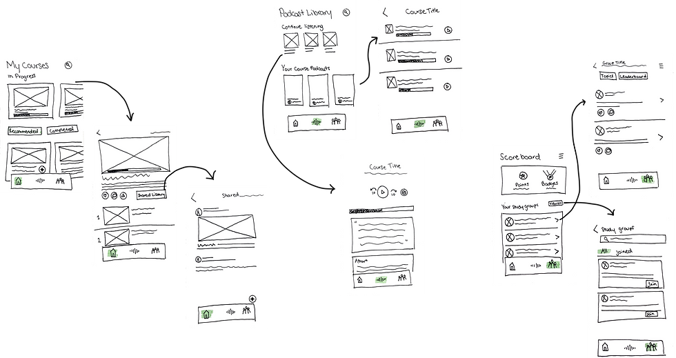
Medium-Fi Wireframes
Served as a bridge between rough ideation and high-fidelity design, allowing for more structured layout planning and early exploration of copy and interactions.
04. Usability Testing & Iteration
Usability Test
We conducted a single round of usability testing with five participants, focused on evaluating motivation and ease of navigation. Participants were introduced to a scenario where they had enrolled in an online course and were asked to explore key features, including the shared library, study group tab, and gamification elements. We asked a mix of generative and evaluative questions (e.g., “Does this motivate you?” or “Where would you check your progress?”) and gathered feedback on features like the podcast learning format and leaderboard visibility. Our key findings were:
1
Users found it challenging to discover study groups and scoreboard features due to competing goals within a single user flow.
4
The process of posting a resource in the study hub was unclear, leading to frustration.
5
Users did not intuitively recognize the podcast icon as representing podcast content.
2
Users found it hard to comprehend our + icons and are in need of descriptive text.
3
Users did not interpret “study hub” as a space for student-created resources or a shared library.
Iteration 1 vs. Iteration 2
Before
.png)
After
Improving Visual Prioritization and Clarity
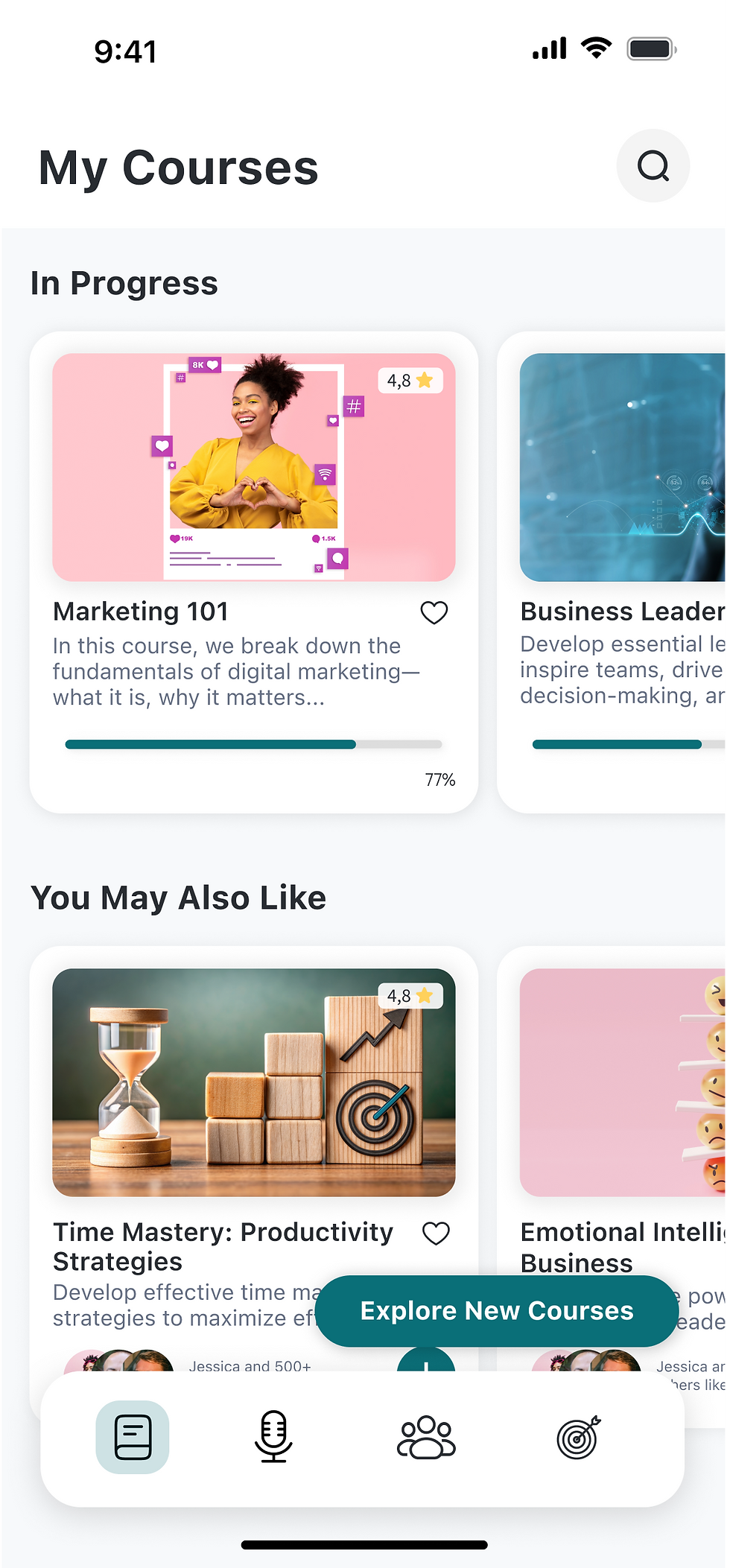
We updated the layout to improve the visibility of progress indicators and adjusted the content hierarchy to better reflect user priorities. “Completed” was de-emphasized in favour of surfacing current and recommended courses first, aligning more closely with what users found valuable.
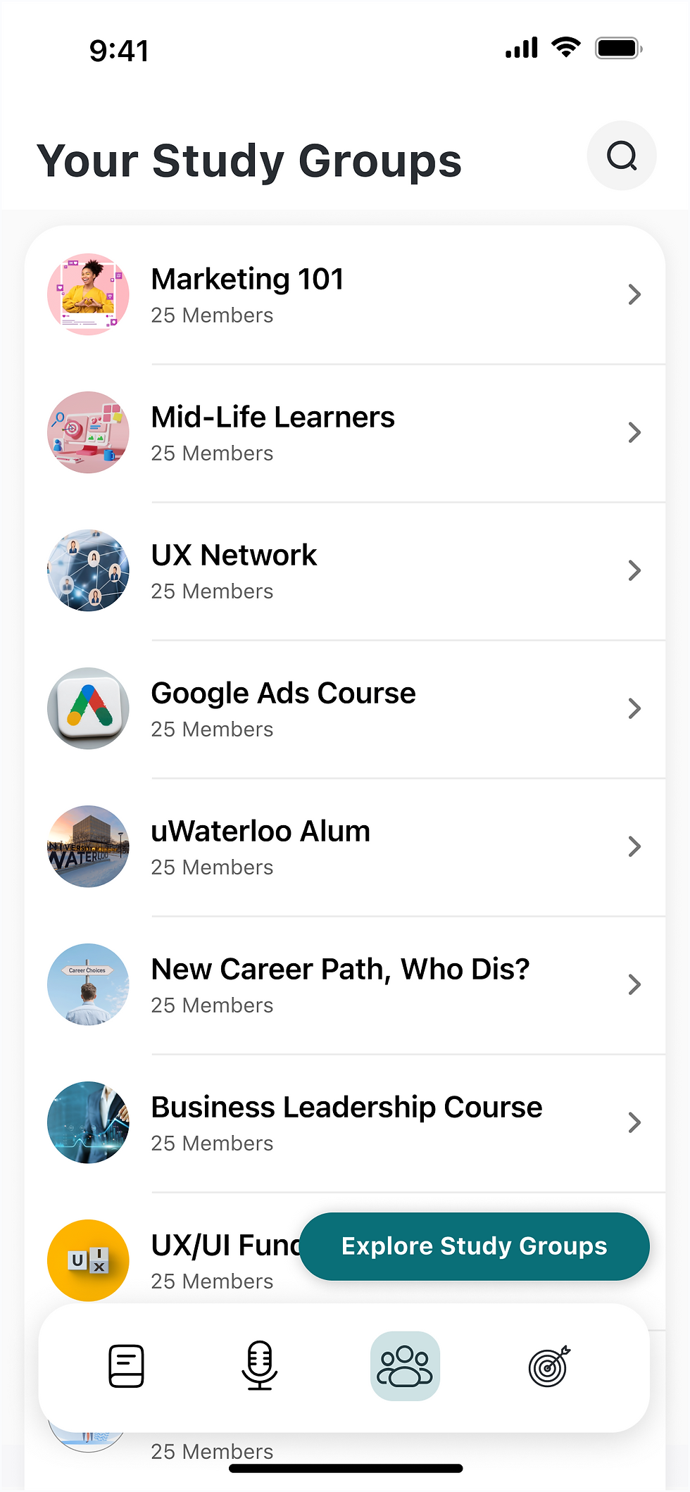
Study Groups and Gamification
We added a new navigation icon in the navbar to separate the gamification features from the study group section. This update provides clearer information on the milestones users need to reach to earn points and simplifies the overall user flow by distinguishing between social and gamified elements.
Before
.png)
After
Before
.png)
After

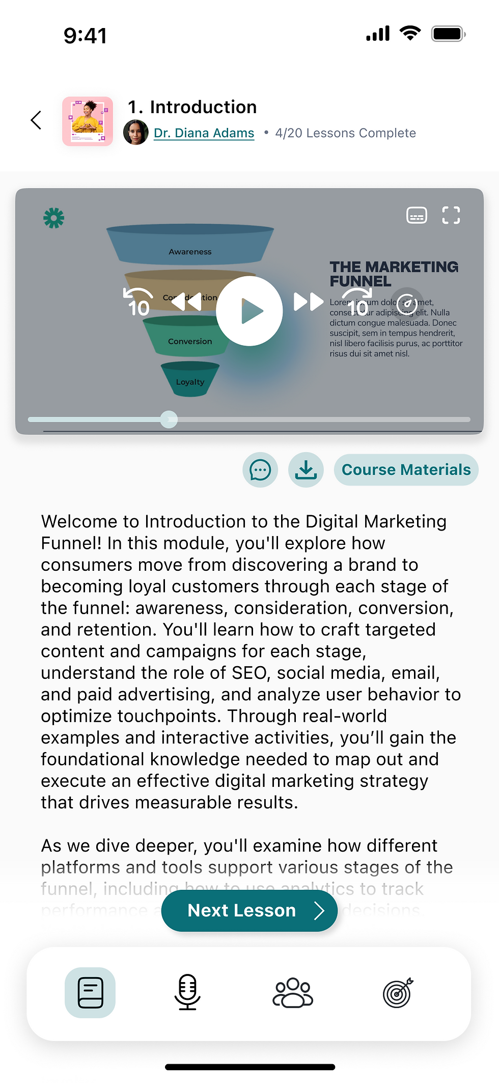
Course Content: Clarifying Navigation and Flow
In Iteration 2, we split the screen into separate views for course content and individual lessons to create a clearer hierarchy and help users preview lessons before diving in. We also renamed “Study Hub” to “Course Materials” to reduce confusion with “Study Groups” in the navigation bar.
05. Final Product
User Interface
While the initial UI was developed in collaboration with my team, I took time post-collaboration to refine the interface with a focus on clarity and consistency. Given the density of course content, my goal was to reduce visual overwhelm and create a calming, user-friendly environment. I applied core design principles like uniform spacing, consistent typography, visual hierarchy, and reduced interface noise, to support a more focused learning experience.
_gif.gif)

.png)