.png)
.png)
PickPath
April 2025 (2-Week Sprint)

Project Brief
This project was completed as part of a two-week design sprint with guidance from mentors at Loblaw. We were challenged to address a real-world problem the company was actively exploring: how to improve the speed, accuracy, and efficiency of the in-store picking process. Throughout the sprint, we received ongoing feedback from Loblaw mentors that informed our iterations and final prototype.
Description
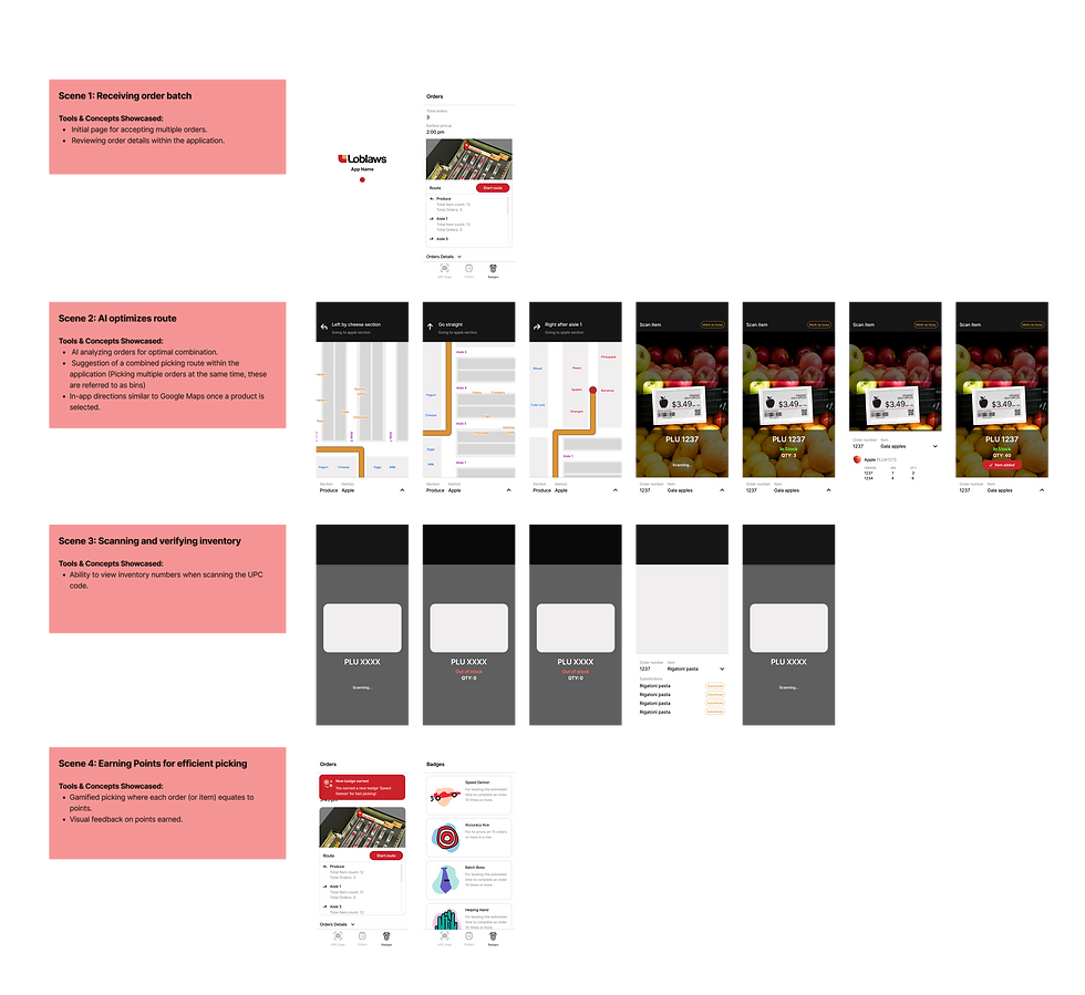
As part of the master’s program final intensive, our team designed an in-store picking app aimed at optimizing grocery order fulfillment for Loblaws employees. Key features include AI-powered order batching and route optimization, a guided picking and scanning system allows employees to quickly locate and confirm items using real-time visual feedback, a dynamic rerouting for out-of-stock items, and added gamified elements like leaderboards and challenges to boost morale and motivation. The result is a solution that improves operational efficiency while supporting a smoother, more engaging experience for employees.

Here's What I Did...
As a collaborative design contributor on the PickPath team, I supported key phases across UX strategy, research alignment, and UI execution—bridging early ideation with high-fidelity deliverables.
Journey Mapping & Ideation
-
Contributed to early-stage journey mapping to identify user pain points and opportunities
-
Participated in group ideation sessions to shape the core product direction
-
Proposed the barcode scanning feature to let users quickly verify the correct UPC when items arrive in a section
Research Oversight
-
Reviewed and guided the research team’s testing plan to ensure alignment with future design goals
Wireframing & UI Design
-
Joined the initial wireframe team to sketch and define layout concepts
-
Led the UI prototyping and iteration phase, refining the interface based on feedback and usability goals
Stakeholder Communication
-
Presented design rationale and progress to mentors throughout the process
01. Research & Discovery
Competitor Analysis
To inform our feature decisions, we conducted a competitive analysis of in-store fulfillment tools, as many companies are rapidly entering this space. This helped us identify best practices, like Walmart’s barcode scanning for navigation, and gaps, such as poor quality control, which led us to incorporate customer notes so pickers could better meet quality expectations.
Persona
We created our user persona based on secondary research into store picker demographics, job structures, and common challenges. This helped us identify core needs, like speed and simplicity, which directly informed our wayfinding strategy.
User Journey
02. Ideation
Problem Definition & Strategic Direction
Challenge
How might we enhance the in-store picking process to improve speed, accuracy, and efficiency?
Solution
Our solution improves the in-store picking process through AI-powered order batching, optimized picking routes, and smart scanning features that reduce backtracking and improve item accuracy. To further boost efficiency and morale, we incorporated real-time substitutions and gamified elements that keep employees engaged and motivated.
Brainstorming
After completing initial research to clarify the problem scope, the team worked within a deadline set by the project manager to propose product backlog items. Team members contributed feature ideas, followed by a structured voting process to establish sprint priorities. This ensured alignment and efficiency before transitioning into low-fidelity wireframes.
.png)
Feature Prioritization
Based on insights from user research and guidance from our stakeholders (mentors), who provided context on current PCX employee workflows, we conceptualized the following core features to address key pain points in the picking process:
01.
AI Smart Order Batching
Pain Points:
-
Frequent backtracking
-
Pressure to go faster
How it Helps:
Groups orders with overlapping items to minimize walking distance and reduce aisle backtracking.
02.
Guided Picking and Scanning (Wayfinding)
Pain Points:
-
Frequent backtracking
-
Interrupted workflows
How it Helps:
Provides optimized routes and live in-aisle guidance, reducing confusion and congestion.
03.
Barcode (UPC) Scanner
Pain Points:
-
Frequent backtracking
-
Pressure to go faster
-
Low-stock issues
How it Helps:
Ensures accuracy in item selection and speeds up confirmation, lowering chances of errors or missed items.
04.
Earning Rewards for Efficient Completion
Pain Points:
-
Low motivation
-
Pressure to go faster
How it Helps:
Gamifies the experience with incentives and recognition, boosting morale and engagement.
Additional Considerations:
-
Quick reroute for substitutions helps pickers efficiently adapt when an item is out of stock.
-
Item notes displayed during picking provide extra context to avoid errors and reduce friction.
03. Design Process
Lo-Fi Wireframes
Initial low-fidelity wireframes, led by my co-lead designer, established the foundational structure based on early research (competitive, internal, and user journey mapping). We explored wayfinding patterns and batch overview layouts, defining core ordering flows and page structure. This phase prioritized alignment and direction rather than artifact refinement.
.png)
User Flow
To complement the feature development, I created a user flow to visualize the picker’s journey through the app. This helped illustrate how the experience unfolds step by step and highlighted key decision points or questions a user might have along the way, ensuring the flow aligns with real picker behaviour and needs.
04. Prototype 1
Prototype 1 was our initial stakeholder presentation, created to showcase key features, design rationale, and the early application structure. This phase focused on validating our understanding of the problem and exploring how the solution would align with the employee picking workflow. Feedback gathered here guided the evolution of Prototype 2.
04. Usability Testing
Usability Testing
We ran two rounds of usability testing with five participants each, combining SUS scoring with open-ended feedback on usefulness, ease of use, and feature expectations. The results helped shape a focused roadmap for iteration. We also brought in stakeholder input, like concerns about in-app badge notifications being distracting, which led us to refine key features before finalizing the prototype.
Key Finding 1
Users thought that the notifications for badges and incentives may be distracting during the picking process.
Key Finding 2
Users were struggling to understand the confirmation message from the buttons and were unsure if the item scanned was added to their order.
Key Finding 3
When scanning the item, there was a delay without a progress bar or an indicator that the item was being scanned, which frustrated users.
06. Prototyping & Iteration
Prototype 2, Iteration 1, represented a key convergence point. Building on stakeholder feedback, we refined the integration between the digital interface and physical picking workflow, strengthened visual hierarchy, and delivered gamification more intentionally.
During this phase, I took a more active lead in shaping the workflow structure and UI direction, aligning design decisions with Loblaws’ digital branding. Previously separate features were unified into a cohesive workflow, creating a more structured and testable experience for user validation.
Iteration 1 vs. Iteration 2
Before


After

Show only the necessary information
Problem: Initial designs presented overwhelming order details, causing cognitive overload.
Solution: We now display only a high-level route overview and the total number of bins at the start.
Keeping the user in the loop
Problem: Unclear scan confirmations and manual substitution requests interrupted the picking process.
Solution: We implemented subtle animations for immediate scan feedback and automated the substitute request process with clear notifications.
Before
%20(1).png)
After
.png)
%20%20-%20Successful%20Substitution.png)
Before
After
.png)

Optimizing for efficiency and fun
Problem: Real-time notifications for gamification elements diverted focus during critical picking.
Solution: Notifications for badges and bingo now
appear only after an order is completed.
05. Final Product
Final User Interface
_gif.gif)
Bonus: Thoughts & Outcomes
Learning Outcomes
This project gave me hands-on experience working in a cross-functional team, where I acted as the designer and collaborated closely with product managers and researchers. I translated research findings and business requirements into actionable design decisions while balancing user needs and feasibility.
Presenting our work to mentors from Loblaws strengthened my ability to communicate design rationale clearly and adapt in real time to feedback. It also taught me how to align user-centered solutions with business goals, and reinforced the value of strong collaboration throughout the design process.
Go to next project
Introducing Nike Sustainability Rewards, an app feature that motivates users to recycle, track their impact, and earn exclusive rewards. By promoting transparency and engagement, it supports Nike’s commitment to environmental responsibility through a seamless, user-friendly experience.
.png)